A Pet-First Quote Form for PetCare Plus
A Pet-First Quote Form for PetCare Plus
A Pet-First Quote Form for PetCare Plus
Built in two days for a fictional pet insurance client, with no existing brand and no access to real users, this mobile quote form uses competitor analysis to shape a pet-first flow, a contextual coverage recommendation, and brand personality that holds from the first screen to the last.
Built in two days for a fictional pet insurance client, with no existing brand and no access to real users, this mobile quote form uses competitor analysis to shape a pet-first flow, a contextual coverage recommendation, and brand personality that holds from the first screen to the last.
Built in two days for a fictional pet insurance client, with no existing brand and no access to real users, this mobile quote form uses competitor analysis to shape a pet-first flow, a contextual coverage recommendation, and brand personality that holds from the first screen to the last.
Role
UX Researcher
UI Designer
Tools
Figma
Claude
Claude Design
Team
Solo Project
Timeline
May '26
Role
UX Researcher
UI Designer
Tools
Figma
Claude
Claude Design
Team
Solo Project
Timeline
May '26

The problem
No Brand, No Users, No Time
The brief set out exactly what needed to be collected: pet owner details, pet details, vaccination status, and a preferred coverage level. It said far less about how to collect any of it, or what "friendly, trustworthy, and modern" should actually look like on a mobile screen.
There was no existing brand beyond three words in a brief, no access to real users, and two days to do it in.
The form was almost the easy part. The real work was deciding what good looked like in this space before designing anything at all.
The problem
No Brand, No Users, No Time
The brief set out exactly what needed to be collected: pet owner details, pet details, vaccination status, and a preferred coverage level. It said far less about how to collect any of it, or what "friendly, trustworthy, and modern" should actually look like on a mobile screen.
There was no existing brand beyond three words in a brief, no access to real users, and two days to do it in.
The form was almost the easy part. The real work was deciding what good looked like in this space before designing anything at all.
The solution
From Generic Fields to a Pet-First Flow
The scope was kept deliberately narrow. One end-to-end flow in Figma, happy path first. Competitor research shaped every major decision, from the order fields appear in to the language in each label.
The order does the reassuring
The form runs pet first, price second, person last. It opens with the pet (name, type, breed, age, vaccination status) because that's who the user is actually here for. An indicative price appears next, before a single piece of owner information is requested. By the time someone reaches their own details the quote is already theirs, and the most sensitive part of the form turns into the home straight.
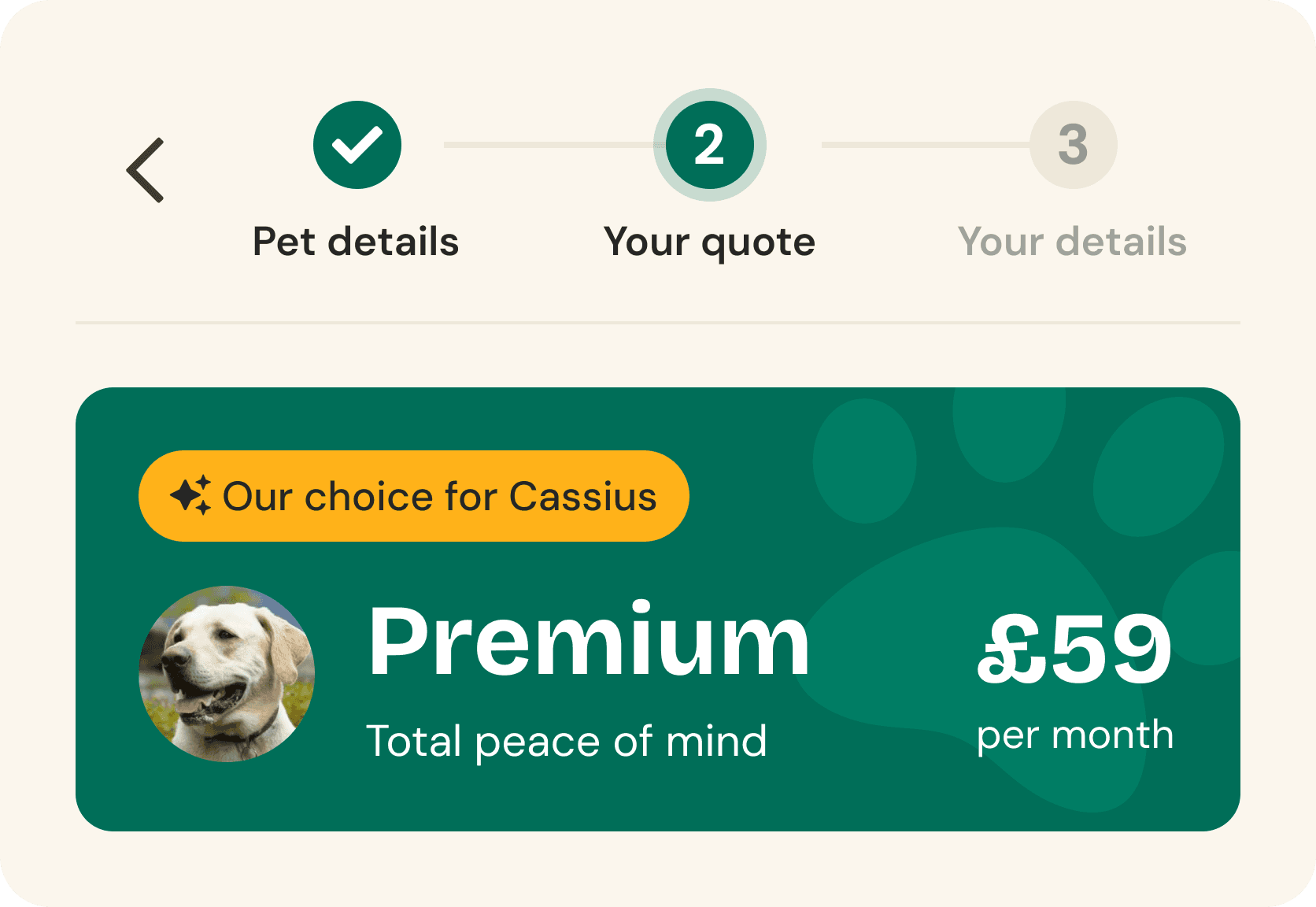
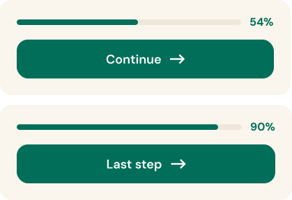
That structure stays visible the whole way through. A three-step indicator (Pet details, Your quote, Your details) anchors the top of every screen, and a percentage bar underneath ticks forward with every answer. This was the most consistent lesson from the competitor testing: every form without progress indication felt longer than it actually was. Nobody filling this one in has to wonder how much is left.
A voice that doesn't switch off
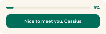
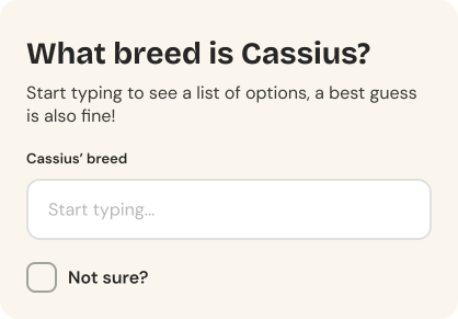
From the first field the example dog, Cassius, gives the form its voice. His name carries into every later screen, in headers, field labels and helper text. "What breed is Cassius?" instead of "Pet breed". Even the buttons join in. Submitting a pet's name says "Nice to meet you", and when the owner finally introduces themselves near the end, the button replies "Nice to meet you too, Ollie". Small things, but they keep the brand's warmth running through the whole journey. Waggel was the only competitor that managed this, and its form was noticeably the most engaging of the three.
Coverage that comes with an opinion
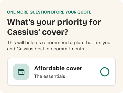
Every competitor presents Basic, Standard, and Premium as a flat list and leaves the user to work it out alone. This form does some of the thinking first. One final question, "What's your priority for Cassius' cover?", is combined with the pet details already given, and the quote screen opens with a suggested plan badged "Our choice for Cassius" above the full list. The copy is careful not to push: "That's just our recommendation, it's entirely up to you." The brief asked for this directly, and nobody in the market actually delivers it.
Fewer chances to get it wrong
Wherever the data allows it, the form removes the chance of a mistake instead of catching one afterwards. Age is a stepper with quick-select chips, not a free-text date field. Pet type, vaccination status, and coverage priority are single taps. Breed is an autocomplete with a "Not sure?" escape hatch, so rescue owners get reassurance ("we'll use crossbreed to get your quote started") where other forms give them a dead end. "I'm not sure" is even a valid vaccination answer, because finding out can wait. Helper copy sits at the moments people hesitate: "A rough estimate of age is absolutely fine."
For the free-text fields that remain, friendly and specific error copy is defined as a copy standard for the build. Two days buys one flow done properly, so the design effort went where the research pointed to the most risk: field order, quote timing, and the recommendation. Accessibility got the same fundamentals-first treatment. Touch targets are comfortable throughout, contrast is checked against the brand palette, and a full audit is scoped as a next step.


The solution
From Generic Fields to a Pet-First Flow
The scope was kept deliberately narrow. One end-to-end flow in Figma, happy path first. Competitor research shaped every major decision, from the order fields appear in to the language in each label.
The order does the reassuring
The form runs pet first, price second, person last. It opens with the pet (name, type, breed, age, vaccination status) because that's who the user is actually here for. An indicative price appears next, before a single piece of owner information is requested. By the time someone reaches their own details the quote is already theirs, and the most sensitive part of the form turns into the home straight.
That structure stays visible the whole way through. A three-step indicator (Pet details, Your quote, Your details) anchors the top of every screen, and a percentage bar underneath ticks forward with every answer. This was the most consistent lesson from the competitor testing: every form without progress indication felt longer than it actually was. Nobody filling this one in has to wonder how much is left.
A voice that doesn't switch off
From the first field the example dog, Cassius, gives the form its voice. His name carries into every later screen, in headers, field labels and helper text. "What breed is Cassius?" instead of "Pet breed". Even the buttons join in. Submitting a pet's name says "Nice to meet you", and when the owner finally introduces themselves near the end, the button replies "Nice to meet you too, Ollie". Small things, but they keep the brand's warmth running through the whole journey. Waggel was the only competitor that managed this, and its form was noticeably the most engaging of the three.
Coverage that comes with an opinion
Every competitor presents Basic, Standard, and Premium as a flat list and leaves the user to work it out alone. This form does some of the thinking first. One final question, "What's your priority for Cassius' cover?", is combined with the pet details already given, and the quote screen opens with a suggested plan badged "Our choice for Cassius" above the full list. The copy is careful not to push: "That's just our recommendation, it's entirely up to you." The brief asked for this directly, and nobody in the market actually delivers it.

Fewer chances to get it wrong
Wherever the data allows it, the form removes the chance of a mistake instead of catching one afterwards. Age is a stepper with quick-select chips, not a free-text date field. Pet type, vaccination status, and coverage priority are single taps. Breed is an autocomplete with a "Not sure?" escape hatch, so rescue owners get reassurance ("we'll use crossbreed to get your quote started") where other forms give them a dead end. "I'm not sure" is even a valid vaccination answer, because finding out can wait. Helper copy sits at the moments people hesitate: "A rough estimate of age is absolutely fine."
For the free-text fields that remain, friendly and specific error copy is defined as a copy standard for the build. Two days buys one flow done properly, so the design effort went where the research pointed to the most risk: field order, quote timing, and the recommendation. Accessibility got the same fundamentals-first treatment. Touch targets are comfortable throughout, contrast is checked against the brand palette, and a full audit is scoped as a next step.
THE SHOWCASE
The Flow in Full


THE SHOWCASE
The Flow in Full
The RESEARCH
Research & Discovery
With no access to real users and no existing brand guidelines to reference, competitor analysis became the primary research method. It meant learning from what's already been tested in market, and it gave each design decision something firmer than taste to stand on.
Competitor Analysis
Pet insurance is a crowded market but not a converged one. RSPCA carries decades of brand equity. Waggel is deliberately modern and personality-led. Vetsure leans into a clinical, medically credible identity. Each caters to a different kind of pet owner, and the market hasn't settled on one approach. That meant every decision for PetCare Plus had to be deliberate, because there was no safe default to copy.
Each competitor was reviewed across three passes, all completed on mobile:
Form structure: mapping the architecture before filling in a single field
Trust and emotion: completing the form as a real user, noting where it felt reassuring and where it created friction
Brand values: checking where personality survived into the form itself, and where it disappeared
Patterns & Findings
Four patterns held across all three competitors.
Pet-first ordering is the emerging standard. All three lead with pet details before owner details, and it's worth following on purpose rather than by habit. The user is here because of their pet, not their address.
Progress indication is inconsistent but always noticeable. RSPCA shows step progress throughout. Waggel and Vetsure don't. Every time it was missing, the form felt longer and harder to commit to.
Brand personality rarely survives past the landing page. Vetsure loses it almost immediately. RSPCA stays visually consistent but loses warmth. Waggel is the only one that carries personality into field labels and helper text, and it reads as noticeably more engaging.
Quote timing is a real strategic choice. Waggel shows the quote before asking for personal data. RSPCA gates it behind an email address. For PetCare Plus, showing value first fits the brand better. It might cost a few email addresses. That's a fair trade for staying friendly rather than pushy.
A few specific comparisons shaped the design directly. Waggel asks "What is your pet's name?" and offers "Not sure exactly?" for rescue pets. Vetsure uses generic field labels with no personality, for the same data. RSPCA reveals fields progressively as previous ones are completed, which kept a long form feeling manageable. Vetsure shows everything on one page, which felt overwhelming on mobile. Across all three, error messages were generic: "Please enter a valid date" turned up on every site in some form. Warm, specific error copy is cheap to get right and changes how the whole form feels.
Questions for the Client
An open brief like this leaves a few decisions that only the client can make. Three I'd raise before anything gets built:
Does gender need to be asked at all? The design keeps it light, a single tap with "Prefer not to say" included, but UK insurers haven't been permitted to price by gender since 2012. If the field isn't feeding the quote, it's friction and stored personal data with no return. If it's there for marketing, that's a call the business should make with its eyes open.
How strongly can "our choice" be worded? A recommendation can shift an insurance sale from non-advised to advised, which carries regulatory weight in the UK. "Our choice for Cassius" should go through compliance before launch, and the answer would shape how confidently the copy can speak.
Which fields actually drive the price? Anything that neither prices the policy nor improves the experience is a question for the sake of it, and the quickest way to shorten a form is to ask less.
Where This Would Go Next
Competitor analysis gives a strong baseline, but it can't confirm whether these decisions work for PetCare Plus's actual customers. Usability testing would be the natural next step, particularly around the coverage recommendation and whether showing the quote before capturing an email helps or hurts conversion in practice. That second question sits well as an A/B test. It's a business decision as much as a design one, and worth settling with data.
Analytics from day one would keep any iteration grounded in real usage: drop-off per screen, time spent on each step, completion rate.
And a full accessibility audit goes beyond the contrast checks and touch targets already in place: auto-focus into fields with visible focus states, keyboard navigation, screen reader behaviour, and how the layout holds up under browser zoom.
The RESEARCH
Research & Discovery
With no access to real users and no existing brand guidelines to reference, competitor analysis became the primary research method. It meant learning from what's already been tested in market, and it gave each design decision something firmer than taste to stand on.
Competitor Analysis
Pet insurance is a crowded market but not a converged one. RSPCA carries decades of brand equity. Waggel is deliberately modern and personality-led. Vetsure leans into a clinical, medically credible identity. Each caters to a different kind of pet owner, and the market hasn't settled on one approach. That meant every decision for PetCare Plus had to be deliberate, because there was no safe default to copy.
Each competitor was reviewed across three passes, all completed on mobile:
Form structure: mapping the architecture before filling in a single field
Trust and emotion: completing the form as a real user, noting where it felt reassuring and where it created friction
Brand values: checking where personality survived into the form itself, and where it disappeared
Patterns & Findings
Four patterns held across all three competitors.
Pet-first ordering is the emerging standard. All three lead with pet details before owner details, and it's worth following on purpose rather than by habit. The user is here because of their pet, not their address.
Progress indication is inconsistent but always noticeable. RSPCA shows step progress throughout. Waggel and Vetsure don't. Every time it was missing, the form felt longer and harder to commit to.
Brand personality rarely survives past the landing page. Vetsure loses it almost immediately. RSPCA stays visually consistent but loses warmth. Waggel is the only one that carries personality into field labels and helper text, and it reads as noticeably more engaging.
Quote timing is a real strategic choice. Waggel shows the quote before asking for personal data. RSPCA gates it behind an email address. For PetCare Plus, showing value first fits the brand better. It might cost a few email addresses. That's a fair trade for staying friendly rather than pushy.
A few specific comparisons shaped the design directly. Waggel asks "What is your pet's name?" and offers "Not sure exactly?" for rescue pets. Vetsure uses generic field labels with no personality, for the same data. RSPCA reveals fields progressively as previous ones are completed, which kept a long form feeling manageable. Vetsure shows everything on one page, which felt overwhelming on mobile. Across all three, error messages were generic: "Please enter a valid date" turned up on every site in some form. Warm, specific error copy is cheap to get right and changes how the whole form feels.
Questions for the Client
An open brief like this leaves a few decisions that only the client can make. Three I'd raise before anything gets built:
Does gender need to be asked at all? The design keeps it light, a single tap with "Prefer not to say" included, but UK insurers haven't been permitted to price by gender since 2012. If the field isn't feeding the quote, it's friction and stored personal data with no return. If it's there for marketing, that's a call the business should make with its eyes open.
How strongly can "our choice" be worded? A recommendation can shift an insurance sale from non-advised to advised, which carries regulatory weight in the UK. "Our choice for Cassius" should go through compliance before launch, and the answer would shape how confidently the copy can speak.
Which fields actually drive the price? Anything that neither prices the policy nor improves the experience is a question for the sake of it, and the quickest way to shorten a form is to ask less.
Where This Would Go Next
Competitor analysis gives a strong baseline, but it can't confirm whether these decisions work for PetCare Plus's actual customers. Usability testing would be the natural next step, particularly around the coverage recommendation and whether showing the quote before capturing an email helps or hurts conversion in practice. That second question sits well as an A/B test. It's a business decision as much as a design one, and worth settling with data.
Analytics from day one would keep any iteration grounded in real usage: drop-off per screen, time spent on each step, completion rate.
And a full accessibility audit goes beyond the contrast checks and touch targets already in place: auto-focus into fields with visible focus states, keyboard navigation, screen reader behaviour, and how the layout holds up under browser zoom.
More Work
You Might Like
More Work
You Might Like
More Work
You Might Like
More Work
You Might Like
More Work
You Might Like
More Work
You Might Like